Normalized Stacked Bar Chart
Data:
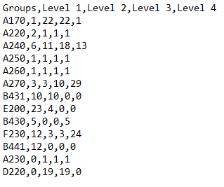
There are two ways of defining data for Normalized Stacked Bar Chart. You can use a CSV file formatted in the following manner:
- First row is always Headers. Headers contain names of individual bars in each group. So in our example its Level 1, Level 2...etc.
- All of the consecutive rows are considered data points. These are all of the Stacks with each row starting with a Stack Name and then values for each data point (in our case Level).
Example of CSV data:
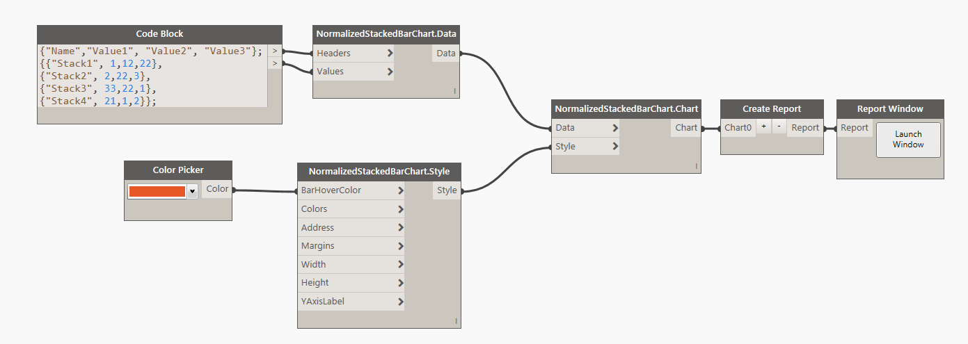
Another way to define data is to generate it from a list directly in Dynamo. You can do it like so:
Style:
There are couple of things that you can define for the appearance of the Normalized Stacked Bar Chart. First is a BarHoverColor. That's a color that a bar will change to when you hover your mouse over. You can use a Dynamo Color node to define that input or you can use the Design Script syntax like so: DSCore.Color.ByARGB(1,100,100,100). Second input is a list of colors. Each bar inside of the Stack can have a specific color of your choosing, or if you supply a null value the default color scheme will be applied ([D3 Categorical Colors] (http://bl.ocks.org/aaizemberg/78bd3dade9593896a59d)). Category20c is the default color scheme. Remaining inputs are integers for Width and Height (default values are 1000px x 500px) and a string for YAxisLabel. Address input can be used to place the chart in a specific location on a page. Grid address represents charts top/left corner. Please see this page for more info on Address. Margins come handy when you need to increase space around the chart to accomodate labels. Please see this for more info.
Example of style definition:

Other:
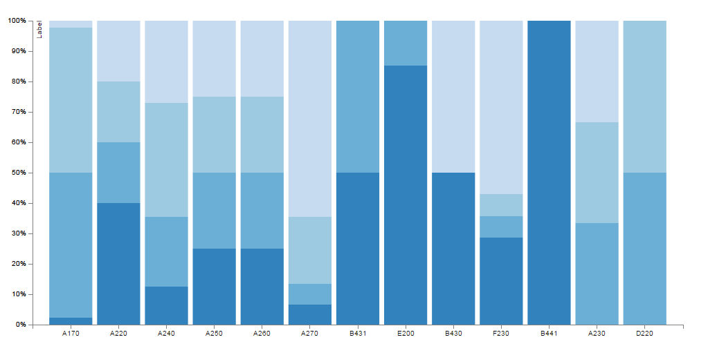
There is no input for Domain when working with Normalized Stacked Bar Charts. That is because all values in each stack will be defined as a percentage of the sum of such values. Normalized Bar Chart like that is useful to represent a relationship of certain values to the whole.